
-
SCAM WARNING! See how this scam works in Classifieds.
-
The Frolic by Limelight Giveaway is over. Congratulations to the winner: Numerous_Nothing!
You are using an out of date browser. It may not display this or other websites correctly.
You should upgrade or use an alternative browser.
You should upgrade or use an alternative browser.
Dynavap VapCap
- Thread starter Fenton Mewley
- Start date
Greetings,
More good things happening this past week. Our first CNC lathe arrived.
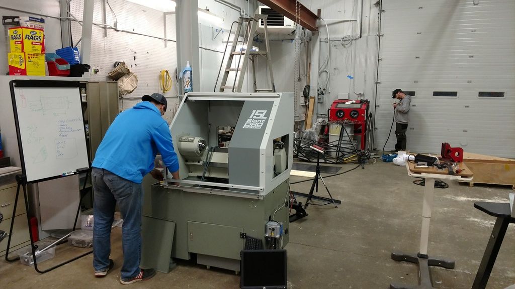
We have it assembled and set, and if all goes well we will be machining our own titanium in house in the next few days.
This is Scott finishing up the assembly.
He is good at many things including but not limited to the laser. This is one of fun parts of where we work. There are many different things to do and we try to mix up the tasks.
It sure seems like a good idea to be in sourcing our parts instead of sending them somewhere else to be made.
The other part about of this is it should accelerate the development and evolution of our products as we will be able to make many more changes as quickly as we want. Minor or major, we will be the only thing in the way to making changes.
So we are trying on our new logo on a few more items.
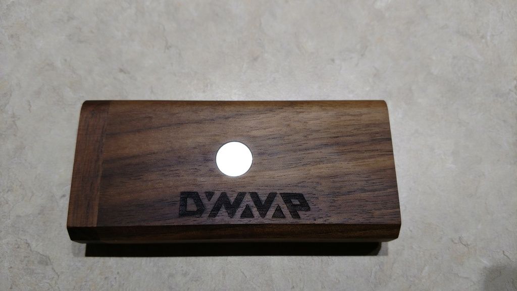
As before I am very interested in everyone's thoughts on this. It has been growing on most of us, but please do help us dial it in.
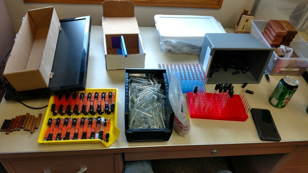
As we continue to grow our assembly line is speeding up and we are making more units every week. Here is a quick shot of one of our current work stations finishing up final VapCap assembly and packaging.
And there is more really good stuff in the works.
Like more metal.
Thank you,
George
More good things happening this past week. Our first CNC lathe arrived.
We have it assembled and set, and if all goes well we will be machining our own titanium in house in the next few days.
This is Scott finishing up the assembly.
He is good at many things including but not limited to the laser. This is one of fun parts of where we work. There are many different things to do and we try to mix up the tasks.
It sure seems like a good idea to be in sourcing our parts instead of sending them somewhere else to be made.
The other part about of this is it should accelerate the development and evolution of our products as we will be able to make many more changes as quickly as we want. Minor or major, we will be the only thing in the way to making changes.
So we are trying on our new logo on a few more items.
As before I am very interested in everyone's thoughts on this. It has been growing on most of us, but please do help us dial it in.
As we continue to grow our assembly line is speeding up and we are making more units every week. Here is a quick shot of one of our current work stations finishing up final VapCap assembly and packaging.
And there is more really good stuff in the works.
Like more metal.
Thank you,
George
Vapor_Eyes
taste buds
@VapCap
I say go with the new logo. I like it a lot, and it seems most of the other people here do too. I like the old one too, and change is hard, but I think the new one is better for the brand.
It's a really cool design with the use of negative space and hidden letters. It's fresh and modern, while also being more subtle and stealthy.
I think it wouldn't take long at all for fans of the old logo to adjust, and newcomers to the family wouldn't even know the logo was new.
I like both logos so I'll be happy no matter what. I'll always have my current gear with the old logo. A new logo would entice me to buy even more new gear.")

I say go with the new logo. I like it a lot, and it seems most of the other people here do too. I like the old one too, and change is hard, but I think the new one is better for the brand.
It's a really cool design with the use of negative space and hidden letters. It's fresh and modern, while also being more subtle and stealthy.
I think it wouldn't take long at all for fans of the old logo to adjust, and newcomers to the family wouldn't even know the logo was new.
I like both logos so I'll be happy no matter what. I'll always have my current gear with the old logo. A new logo would entice me to buy even more new gear.
nickdanger
Collector of Functional Art
I have grown to love the new logo. Looks really nice on the 'stash! And it does look like great things are happening at Dynavap. I always look forward to your updates.
Kalessin
Well-Known Member
Personally, I don't like the new logo on the stash. I like it for the caps, maybe other merchandise. But I feel like the older logo with the vapor wisp fits the wood look better. But I can see why you would want to go with one or the other for everything, simplifies thingsGreetings,
More good things happening this past week. Our first CNC lathe arrived.
We have it assembled and set, and if all goes well we will be machining our own titanium in house in the next few days.
This is Scott finishing up the assembly.
He is good at many things including but not limited to the laser. This is one of fun parts of where we work. There are many different things to do and we try to mix up the tasks.
It sure seems like a good idea to be in sourcing our parts instead of sending them somewhere else to be made.
The other part about of this is it should accelerate the development and evolution of our products as we will be able to make many more changes as quickly as we want. Minor or major, we will be the only thing in the way to making changes.
So we are trying on our new logo on a few more items.
As before I am very interested in everyone's thoughts on this. It has been growing on most of us, but please do help us dial it in.
As we continue to grow our assembly line is speeding up and we are making more units every week. Here is a quick shot of one of our current work stations finishing up final VapCap assembly and packaging.
And there is more really good stuff in the works.
Like more metal.
Thank you,
George
Edit: also, if it is gonna be the new logo, maybe try running it parallel along the bottom? I think I would like it better that way, it looks kind of...unbalanced to me the way it is here
Last edited:

natural farmer
Well-Known Member
That looks better!

Kalessin
Well-Known Member
Awesome, I was thinking bottom edge, but top is even better
TheVaporist
Man is a universe within himself
As I said before, the new logo doesn't fit well with a classy wood . . . I think it's too modern to fit the classy atmosphere , inspired by a nice and beautiful wood piece . . .
However I still like this logo , but I see it on my mighty for example , more than on a woody . . .
I think you should look at something more spiritual for the logo, try to make something with a soul , like your vapcap !
Cheers George !
However I still like this logo , but I see it on my mighty for example , more than on a woody . . .
I think you should look at something more spiritual for the logo, try to make something with a soul , like your vapcap !
Cheers George !
Last edited:
syrupy
Authorized Buyer
The new logo reminds me of VGER from Star Trek, with its obscured lettering.
It looks too jammed up together to my eye. The "D" has a big chunk taken out to fit the "Y". But the "Y" symbol is too small to read as a "Y", and for some reason looks smaller than the (inverted) symbols for "A". Bring back the Y! Contributing to the confusion is left letters leaning to the right and right letters leaning to the left...at different angles? There needs to be breathing room between the lettering, to allow the word to emerge?
I keep thinking "font = klingon" but maybe I just watch too much Trek. Best of luck on the new logo.
*plainlazy*
Well-Known Member
I prefer new logo on the caps but old logo on the stash. Just my opinion.
natural farmer
Well-Known Member
After my initial doubts I think I like the new logo but I also feel that it could be improved as you said...The new logo reminds me of VGER from Star Trek, with its obscured lettering.
It looks too jammed up together to my eye. The "D" has a big chunk taken out to fit the "Y". But the "Y" symbol is too small to read as a "Y", and for some reason looks smaller than the (inverted) symbols for "A". Bring back the Y! Contributing to the confusion is left letters leaning to the right and right letters leaning to the left...at different angles? There needs to be breathing room between the lettering, to allow the word to emerge?
I keep thinking "font = klingon" but maybe I just watch too much Trek. Best of luck on the new logo.
I would change the first and last letters I think to something more edgy and aggressive to match the rest of the letters and maybe improve the angles as well so that it comes out more uniform.

How about having the option of no logo. I like to be inconspicuous.
I was thinking the bottom of the dugout maybe.
Copacetic
Somewhere North of The Wall
How about on the Stash lid, with more lids available, with different logo's?
I love @VapCap and the products.
They have a 'classy heirloom' feel about them, but the feeling I get from the new logo is very different.
George, you have gone WAY beyond the call of duty for me, and I've seen nothing but positivity in this thread, so it's difficult to criticise your descisions and designs.
But, in the spirit of constructive criticism, I'm saying that I'd rather something that has a much more 'classic heirloom' feel than the jagged, straight edge approach.
Instead of suggesting the sort of 'advanced design, made by craftsmen from the best traditional materials' product that the VC, Stash, and other Dynavap designs are. The straight edged, angular or "edgy, agressive" approach evokes Tron and 80's hair metal.
Just kidding, but I've got to be honest and offer my opinion that a more rounded, flowing typeface/ logo style would be much more fitting for this brilliant bleeding edge design made from beautiful, and often 'traditional' materials.
Sorry for the wordy, cringy criticism, I'm very aware that I'm stinking up a brilliant thread, and offering advice to a man who came up with something brilliant, when I did not.
I could be wrong
Kalessin
Well-Known Member
If George decides to change the stash permanently to a new logo, maybe those of us with the older style will have highly collectible and valuable models in 10 or 15 years. Most vapes go out of style in that amount of time, but I could see Dynavap sticking around and remaining relevantThey have a 'classy heirloom' feel about them, but the feeling I get from the new logo is very different.
Last edited:
herbalist33
Well-Known Member
i havnt commented on the new logo yet, mainly because I still don't really know what I think of it... When I first saw it, it took a second or two for my brain to be able to distinguish all the letters, and then I saw it, but it was an unpleasant read if that actually makes sense, my brain didn't like the feel of the word once it had read it.
I like the look of the design, but just not for this company/brand. And what tipped me over the edge is the look of it on the Dynastash- I really don't like it the way it is in George's picture.
I don't have the time to go back and quote, but when George first suggested the new logo someone pointed out that a logo is supposed to first and foremost convey the brand, including the name. You want to be able to read it and recognise it quickly, not have to decipher it. It's better for marketing and brand awareness to have a more clear logo too, and I just don't think the new logo is clear enough, especially if you've never heard of Dynavap.
So I personally prefer the old logo, especially for laser engraving onto wood and metal. Although whoever created the new logo could perhaps help with the paper/white version of the old logo font- The lettering is ok, but the green has always not sat well with my eyes... I think a more organic grey with some colour flourishes or something would work a lot better, not so jarring in the eyes (but again this is all just my personal opinion).
One last thing about the new logo... as Im sat here, capped to the max, the new logo to me almost reads 'Omnivap'. So perhaps we could modify the lettering but keep the style, so that it does read 'Omnivap', and then have that lasered onto the Omnivap caps?
Or how's this for a highdea:
How about @VapCap changes the names of the Vapcap models slightly. And sticking with the modular system we all love, we could employ 'vap' in all the names, such as:
OmniVAP
GlassyVAP (OG Vapcap to you and me)
WoodyVap (ti woody)
CarbonVAP
DamascusVAP
And then (even tho I am beginning to dislike the whole apple style etc) you could have the 's' models.
GlassyVAP.s.
WoodyVAP.s.
Etc
This would make all the models a bit more coherent and simplify things a bit, and you could tie in nicely with a good logo format that suits the modular names. Perhaps the artist of the new logo could try their hand at this idea? I think this would make it a lot easier for customers to understand what's going on with the different models.
That's it, my high has been drained, I am now lacking in minerals, must refuel via Omnivap... have a think guys, il be back soon
Peace

The new logo gives me an industrial vibe, which is what I would expect from a name like "Dynavap"
On the contrary, I would say much of Dynavap's products are more organic and natural than the name alludes to.
On the contrary, I would say much of Dynavap's products are more organic and natural than the name alludes to.
Last edited:
Squiby
Well-Known Member
Most vapes go out of style in that amount of time, but I could see Dynavap sticking around and remaining relevant
I predict that the Vapcap will be a household name in a few years. I think it will be here for the long haul with all kinds of knockoffs trying to gain a corner of the Vapcap market.
My Vapcaps will be passed on to the next generation. A real keepsake and an efficient, beautiful heirloom.
Vapenvy
Indie vaper
Thanks to all of you so much for giving so many great tips . You are such an incredible nice community!
Unfortunately, unlike @Aezhenn
So I decided to put the Woody away for some time now. It's too frustrating at the moment.
So basically I have 2 options now:
1. Leave it packed away and probably never use it again
2. Order spare screens and some new stuff from Dynavap and try again with fresh parts?
I decided to go for number 2
I will wait for the spare screen to arrive and then give everything a fresh new try .

Hi Tony,
You don't have to spend (lots) more money to test if it is the screen giving you issues.
With the vapcap bowl so small, a ss mesh screen from virtually any other vape, or available at any tobacconist, can be cut down to size and pushed into the bowl.
I use the ceramic screen as the template and simply cut around it with a pair of scissors. I don't even need the c-clip to hold it in place.
I found this increased airflow and gave better effects than the ceramic screen.
Also, i find the vapcap has a very unique vape signature, so while many here say it is very effective for them and wipes them out, I use it as one of my vapes for lighter effects.
It's not that it doesn't work (it's awesome and i just bought more), it's just that the effects (for me) seem quite different and i am often thinking 'am i there, am i not?' Of course, it's so much fun to use, another bowl to be sure is not a chore...
Maybe something like this is what you are experiencing?
Hope that helps.
Baron23
Well-Known Member
a logo is supposed to first and foremost convey the brand, including the name.
Nt necessarily...look at all of the car manufacturer badges....they convey the brands name but do it via a symbol that is associated with the brand name in the market's mind. Legability is not a requirement. You look at an apple symbol with a bite out of it and you know its Apple...that kind of thing.
Just a stray thought LOL
I'm not getting the new logo, it looks better in 3d on the stash but I prefer the lines of the old one.
As this is my 1001st message I thought it only right to push the boat out and share it with the VC community.
Had a bit of time on my hands whilst I wait for some wood, so stuff got finished, and then I took a video of said stuff, as you do.
Anyone who hasn't jumped in because they are worried about the VC having such a short vapor path that it may be harsh, first part of this video is for you, after that it all gets a bit silly. @VegNVape Vapcappery.
This one is for the folk who need a bit more than 0.05g to get them where they need to be.
1st and 2nd cycle loads of flavor, 3rd and 4th were just like this one before I handed it to @Ruta.
@Fat Freddy this was tested dry 3 or 4 times and it was reliable enough to be able to do when full, if your cap is still erratic then contact George, I am sure he will look after you.
@HD Springer got a sneak preview earlier and I think he approved.
@VapCap as the song in the background goes 'click click click'.
Vapenvy
Indie vaper
@phattpiggie I cannot believe that you did the apple bong thing.
I was thinking about worst case scenario vapcap uses a couple of days ago and was going to try the apple bong once i got my new vapcaps (which arrived yesterday). That's uncanny.
Reminds me of the first Byron Bay Festival. Camping. We had the gear (from a freaky drive to Nimbin), but no tools to smoke it except a cone (bowl). Somebody said they heard about using an apple, so we macguyver one together, which kinda worked until the people next to us took pitty and gave us a little pipe. Lucky break... and thanks from the future to whoever you were.
The days before batteries or butane still had their challenges...