
-
SCAM WARNING! See how this scam works in Classifieds.
You are using an out of date browser. It may not display this or other websites correctly.
You should upgrade or use an alternative browser.
You should upgrade or use an alternative browser.
Flower Mill
- Thread starter FlowerMillJohn
- Start date
Been a long time lurker and ordered a mighty and a flowermill last week. Got the mighty Wednesday and have a flower mill coming today CANT WAIT TO TRY IT! However, I completely regret not getting the ring and other grinding plates. Hopefully the mighty likes the standard mill.
Shit Snacks
Milaana. Lana. LANA. LANAAAA! (TM2/TP80/BAK/FW9)
Been a long time lurker and ordered a mighty and a flowermill last week. Got the mighty Wednesday and have a flower mill coming today CANT WAIT TO TRY IT! However, I completely regret not getting the ring and other grinding plates. Hopefully the mighty likes the standard mill.
Unfortunately for that particular vape I think you're really going to want the finer grind plates... Session conduction likes a finer grind, standard may be too coarse
Shit Snacks
Milaana. Lana. LANA. LANAAAA! (TM2/TP80/BAK/FW9)
I'm digging it...I'm trying to add pics but I don't think I'm doing it right ugh
Use imgur or imgbb .com to upload the photo and then paste the bb code here, or even just the URL... There's a way to upload photos directly here but it's a little more involved and I don't even know how myself exactly since I'm always on mobile lol
Also by the way you can use the edit button at the bottom of the post, up to 6 hours afterwards, instead of posting back to back

Thanks a lot for the update! Most people talk to in person say they had to get used to the new technique when they've been using traditional grinders for years prior.after a little more time with my fm i am really happy with the results … initially i was not putting enough pressure on the lid while milling … now that i’m applying more pressure i’m getting the results everyone else was talking about! even, fluffy & quick !
Music to my ears!I had another great experience with the FM the last time I used it. I put a nug that was more stem than usual and seeing it separate from the flower with no extra work was impressive.
Thanks so much! Don't worry, the Standard is a workhorse. Less pressure can help coax it into a finer crumble.Been a long time lurker and ordered a mighty and a flowermill last week. Got the mighty Wednesday and have a flower mill coming today CANT WAIT TO TRY IT! However, I completely regret not getting the ring and other grinding plates. Hopefully the mighty likes the standard mill.

Want to say an important thing to everyone:
Flower Mill is growing, and I have to say a huge thanks to everyone here for their contribution to the product and word of mouth.
We're a group of friends who built a product; not necessarily seasoned CEOs. So as we prepare for larger scale distribution in the USA, we're finding ourselves needing to make a few changes that are hopefully wise for the long-term of the Mill and it's tech. Some of these things hurt to do, but must be done for the time being.
One fairly simple thing is the Mill is getting an actual logo on the front. We rejected the idea for a while, because we all personally value products that don't feel the need shout their name at you on prime real estate. But the advice given was wise, and hard to ignore. So we added a small logo. This is our (jay's) best idea; it just looked weird everywhere else.. Thoughts and contributions welcomed:

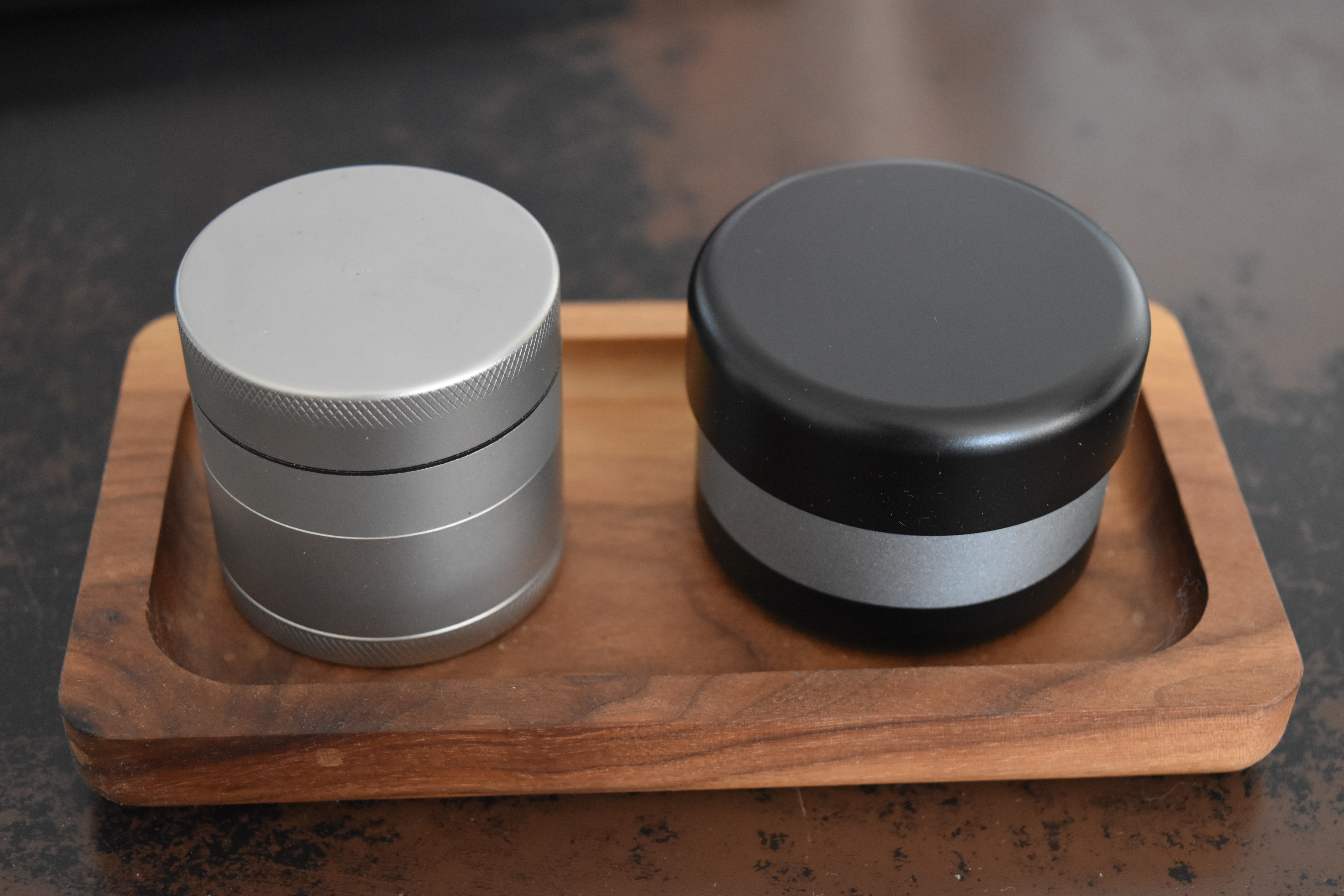
Second, we're going to start selling both Mills solely as 3-piece configurations, and the kief catch will become a separate accessory. I really believe the best FM experience is with the deep bowl that the 3-piece, and we'd always had a company vision of not using the term "3 and 4 piece," since we wanted to move away from traditional grinders and everything related to them. This also helps simplify our lineup, and makes the Mill more approachable for stores to stock. (And then get into peoples rituals!)
Thirdly, and most importantly, we're raising our prices slightly in order to cover additional distribution costs, as well as to cover some manufacturing costs that have steadily increased. When we stopped manufacturing the Mills ourselves in AZ and made the tough decision to search overseas for manufacturing, we were lucky to be able to find an extremely high-quality shop to produce our parts and ship them to us for assembly and boxing. (The quality actually went up) We have to shift prices slightly to afford to stay high-quality and distribute on larger scale, simultaneously. If we do that at the sacrifice of reasonable profit, the company won't be able to grow and protect the designs, which could stop us from making more useful-products. I hope that makes sense. Our goal is to make our products as inexpensive for the customer as possible, while still maintaining top quality. Pricing will be finalized shortly.
TL;DR: if you're on the fence for trying out a Mill, I'm urging you to do so right now of you'd like to get one the way it exists now! I'll also toss you guys a coupon code for the site that will keep existing prices for FC members until this Sunday at 12am! Pluuuus your 15% discount, don't worry.

Thanks for reading, and I hope the changes don't affect anyone's experience! Here to answer any questions.
Oh also, colours might be a thing soon.. Opinions?

Shit Snacks
Milaana. Lana. LANA. LANAAAA! (TM2/TP80/BAK/FW9)
One fairly simple thing is the Mill is getting an actual logo on the front. We rejected the idea for a while, because we all personally value products that don't feel the need shout their name at you on prime real estate. But the advice given was wise, and hard to ignore. So we added a small logo. This is our (jay's) best idea; it just looked weird everywhere else.. Thoughts and contributions welcomed:
Love all the growth, and support you regardless, but I really do not like the way that looks at all... I much prefer it with the plain text less logo on the top and the small flower mill worded logo on the bottom. I understand you feel the need to put the brand out there more though, glad I have mine already anyway lol other grinders do it this way with wording on the top, I know most members here will prefer it without...
Second, we're going to start selling both Mills solely as 3-piece configurations, and the kief catch will become a separate accessory. I really believe the best FM experience is with the deep bowl that the 3-piece, and we'd always had a company vision of not using the term "3 and 4 piece," since we wanted to move away from traditional grinders and everything related to them. This also helps simplify our lineup, and makes the Mill more approachable for stores to stock. (And then get into peoples rituals!)
Thirdly, and most importantly, we're raising our prices slightly in order to cover additional distribution costs, as well as to cover some manufacturing costs that have steadily increased. When we stopped manufacturing the Mills ourselves in AZ and made the tough decision to search overseas for manufacturing, we were lucky to be able to find an extremely high-quality shop to produce our parts and ship them to us for assembly and boxing. (The quality actually went up) We have to shift prices slightly to afford to stay high-quality and distribute on larger scale, simultaneously. If we do that at the sacrifice of reasonable profit, the company won't be able to grow and protect the designs, which could stop us from making more useful-products. I hope that makes sense. Our goal is to make our products as inexpensive for the customer as possible, while still maintaining top quality. Pricing will be finalized shortly.
I think the price increase is totally reasonable and I love the new three-piece only model, so that way it is simpler and keep tray is just another accessory like the plate pack! Now that's a great idea

Oh also, colours might be a thing soon.. Opinions?
LOVE that blue one!!

710yota
Have you heard about the boom on Mizar 5?
Congrats on your growth even if it does add up to some difficult decisions along the way! I actually don't mind the text logo, I think that's about of clean of a way to do it as any. The color options are looking pretty radical, I would offer colored parts separate so some of the rest of us can upgrade if we are feeling real fancy 
Y'all know how much I love the Flower Mill. If it had the logo on it, I NEVER would have bought it. Have you actually tested the logo vs non-logo options? Focus groups, surveys etc.
My read is that both the FM and BCG are distinguished enough that logos marring the look are even less necessary (and that design is definitely marring it).
Consider the lovely flower thingy your logo and move on. It isn't like the name isn't on the bottom of the grinder (where you could also put a QR code).
You have a clean look for a great product. Don't ruin that for the sake of branding.
Vaporware
Well-Known Member
If the first FM I saw had the logo on it I still would have bought it, but I’m glad that I have the current design.
I’ll still recommend it to other people, and I don’t think the logo will be a deal breaker for most people, but if you do move forward with it you might consider holding onto some lids with the current design for people who ask you for it.")
The other changes also seem reasonable, although breaking $100 before the extra plates might lose some people. I suppose the standard version still gives people a more attractively priced option though.
Anyway, good luck with the expansion and I’m glad FC’s been able to help!
If I lost all of my grinders today, I’d order another Flower Mill tomorrow. (Before the logo change. )
)
(…and then I’d have 2 because apparently I only lost grinders? Or is it going to be classified as a grinder now so shops know what to do with it? )
)
Alright. Time for my Millr date.
I’ll still recommend it to other people, and I don’t think the logo will be a deal breaker for most people, but if you do move forward with it you might consider holding onto some lids with the current design for people who ask you for it.
The other changes also seem reasonable, although breaking $100 before the extra plates might lose some people. I suppose the standard version still gives people a more attractively priced option though.
Anyway, good luck with the expansion and I’m glad FC’s been able to help!
If I lost all of my grinders today, I’d order another Flower Mill tomorrow. (Before the logo change.
)(…and then I’d have 2 because apparently I only lost grinders? Or is it going to be classified as a grinder now so shops know what to do with it?
)Alright. Time for my Millr date.
kel
FuckMisogynists!
My 2 cents, no really, this is just my opinion, get your pinches of salt ready...
Another no for the logo from me, sorry, I only mean this in the most constructive of manners, but this sucks
I mean I would be painting over it 100% for sure, I would not want to sit looking at such excessive branding on a daily basis, it's not like I am going to forget what it is. Perhaps think of your customers daily use for years to come, not how it looks on the shelves trying to entice people to buy?
edit: suggestion, if you want the logo, you could put a sticker on it that can be left on or removed as people prefer. Choice about these matters is intensely personal, you're never going to make everyone happy, but there are compromises that speak to both desires perhaps?
Even the flower on the top created some resistance for me, but as it happens, I have grown to like it.
I agree that the flower is logo enough, be happy!
No worries re. costs, business goes on, if you are going to drop $100 on a mill $10 - 20 extra isn't going to make any difference.
The colours are lovely, but your product shots, dude... what is going on with the half mill buried in the table and the purple things at the back? Are they stands?
The all black option looks great!
Coloured flowers on the top to match the centre ring?
I sincerely hope this helps and wish you all the best regardless of whatever you decide
edit 2:
I bet you would see an uptick in sales if you removed the logo altogether and did an all black / stainless steel interior version, that would look totally sick. Also, I like products that inspire discussion and questions, no one *ever* asks me about products where the brand name is front and centre for all to see, but people DO ask me about products that are a bit more mysterious. This gives way to a conversation and lots more questions, oh who are they? do you like it? etc. Not a rule, but a good generalisation!
dang, I just spotted the all stainless(?) version, that looks shiny!
Shiny!
Last edited:
IsaacHayes
Salty Balls™ Authorized distributor
Hello @FlowerMillJohn , Where is the new workshop that produces for you? Thanks.Thirdly, and most importantly, we're raising our prices slightly in order to cover additional distribution costs, as well as to cover some manufacturing costs that have steadily increased. When we stopped manufacturing the Mills ourselves in AZ and made the tough decision to search overseas for manufacturing, we were lucky to be able to find an extremely high-quality shop to produce our parts and ship them to us for assembly and boxing. (The quality actually went up) We have to shift prices slightly to afford to stay high-quality and distribute on larger scale, simultaneously. If we do that at the sacrifice of reasonable profit, the company won't be able to grow and protect the designs, which could stop us from making more useful-products. I hope that makes sense. Our goal is to make our products as inexpensive for the customer as possible, while still maintaining top quality. Pricing will be finalized shortly.
Last edited:
seki
Well-Known Member
I've got to throw in with the "no logo" crew here. I get that this may be falling on deaf ears as you guys have had great success with rebranding and this seems to fall into that same line of thinking. But the brand-less grinder looks amazing IMO. I think you guys should go in the opposite direction and remove it entirely:
I understand this is a marketing thing, but my perspective on the end-user side is that the grinder is a tool that I use to prepare substances that I consume. In that way, it's no different to me than a knife I use to prepare food. Of course function is the ultimate deciding factor, but if I saw a knife in a store with gigantic logos all over the hilt or blade, I'd probably be more inclined to pass it over on first glance.
Edit: Similar to what @kel mentioned below, subtle branding is the most effective for me. One of my favourite vape examples is the Supreme. I never would have noticed if I didn't have an older model to compare, but I'm positive the change to the stand portion was deliberate. While the Supreme has plenty of design issues, this was a pretty cool aesthetic change:
Last edited:
kel
FuckMisogynists!
function is the ultimate deciding factor, but if I saw a knife in a store with gigantic logos all over the hilt or blade, I'd probably be more inclined to pass it over on first glance.
This! For ALL the things I buy... ever!


I will tolerate some branding, but subtle is best - check out the outstanding design work on the branding in this solidtechniks pan for example, once you spot it... it is as permanent as these things get, but absolutely does not detract from the product or using it in anyway... every. single. time. I use this pan in front of someone they *always* ask what it is and how they can get one because they are blown away by the performance, flavour, resilience, multi-generational guarantee - loads to talk about!
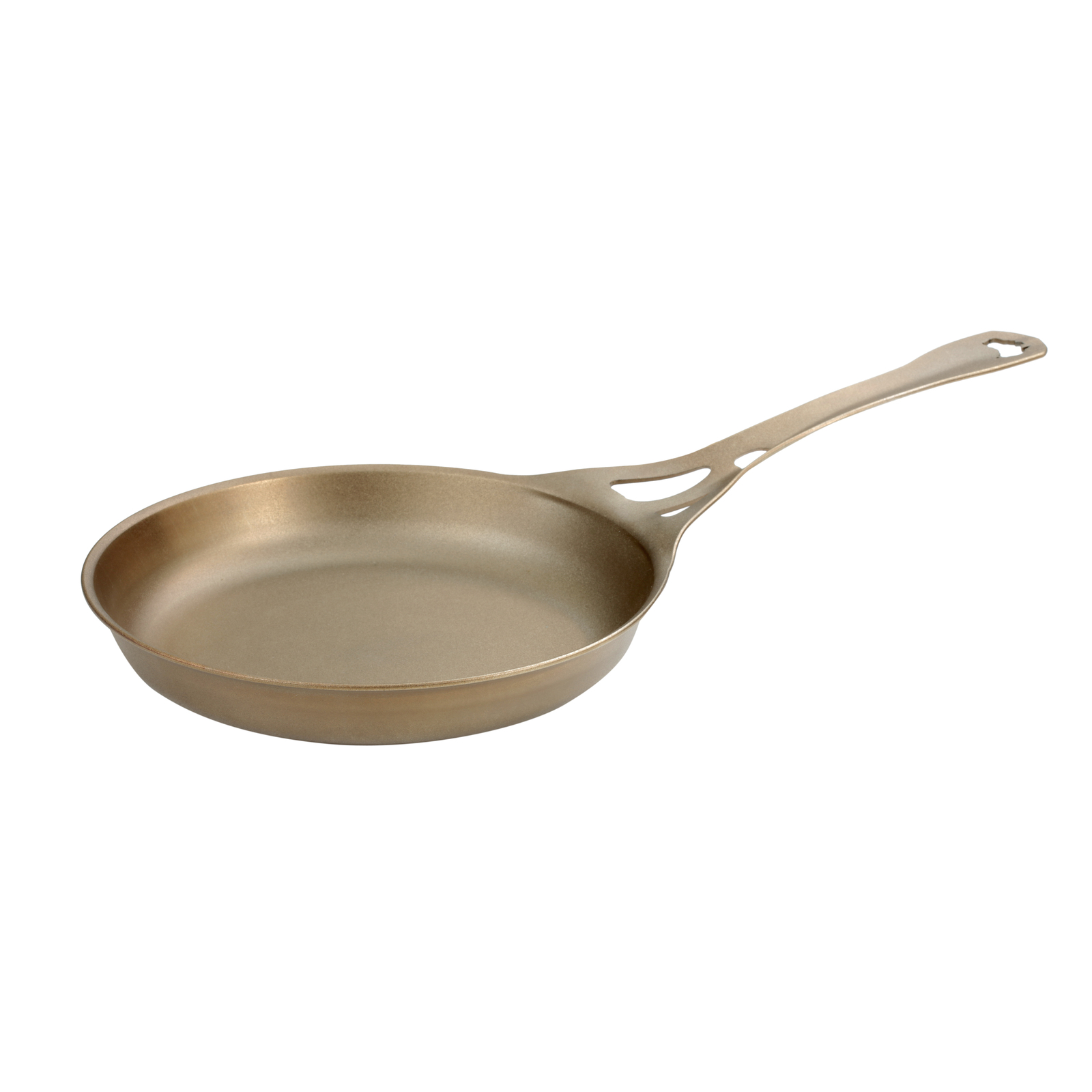
26cm 'Satin' Iron Workhorse Frypan - Australian made by Solidteknics
26cm Satin AUS-ION Wrought Iron Workhorse Frypan. 100% made in Australia. Suitable for all heat sources (including induction). Healthy, sustainable, multi-generational cookware.
Last edited:
oldfool
Well-Known Member
My sentiments exactly.Even the flower on the top created some resistance for me... The all black option looks great!
I think you guys should go in the opposite direction and remove it entirely:
MikeRotchHertz
Well-Known Member
Funny, I just messaged them requesting to see if an unbranded model would be possible. +1 for clean and sleek. Let the engineering be the recognizable factor, although I also identify the need for brand recognition from a distance. I guess branding can always continue as the default, but it's nice to offer the unbranded option for those who prefer
Cheebsy
Fermentation Fiend
I have been thinking about getting one of these, but I intend to buy next time I visit the States to save some money and to get the entire package. I am put off by the existing branding, that flower is totally in your face already! I think if the branding gets any more in your face it would be a deal breaker for me, sorry guys.
Just spitballing: perhaps you could remove a few layers of petals, or tone down the contrast between petals for more understated branding?
Appreciate the heads up and the offer, been wanting one of these since FC member Muunch turned me onto these back when you guys were still Roiel!
Appreciate the heads up and the offer, been wanting one of these since FC member Muunch turned me onto these back when you guys were still Roiel!
Last edited:
triskelion
Member
No logo no 15% increase?
FlowerMillAaron
Active Member
While we're here...
I always wondered why the logo was not a facsimile of the rotor flute pattern, especially the new 20 flute version - a two tone black on black version of that on the top, perhaps an etched pattern... that would be sweet!
We tried. Oh, did we try. But at the time we only had the 10 flute and couldn't get it to not look like a wagon wheel. Plus we thought if the rotor ever did change people would wonder why our logo looks the way it does... Eventually we found a creative agency that made something that looked so much more like a flower, and one decreasing in size at that. We fell in love with the more organic look of it. The 20 Flute does have a much more organic look to it as well but I don't think we could handle a complete logo change right now!
Thanks everyone for your honest feedback! John will be in soon to go through it all more closely.
Gigsabits53
Well-Known Member
I will just chime in to say that I'm neutral on the branding. Not a deal breaker for me.
kel
FuckMisogynists!
Awwww... dammit!

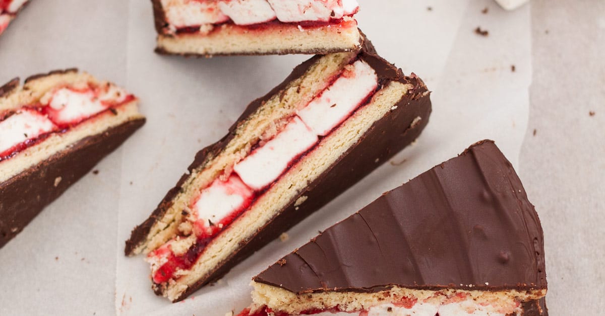
Now I have a wagon wheel craving and am going to have to make this...
 www.sugarsaltmagic.com
Oh... and what's wrong with wagon wheels?
I know what you mean, finding the right creative person can be challenging...
Now I have a wagon wheel craving and am going to have to make this...
Giant Wagon Wheel
This Giant Homemade Wagon Wheel Biscuit is a delicious combination of biscuit, marshmallow and raspberry jam all smothered in dark chocolate. #wagonwheel
www.sugarsaltmagic.com
Oh... and what's wrong with wagon wheels?
I know what you mean, finding the right creative person can be challenging...
cx714
Unregulated Tendencies
Agree with the others— no bid for that logo at all. What is it from a brand perspective that needs the tacky label?
The Brilliant Cut is instantly recognizable in any (and many) Instagram feed and doesn’t even have a name on the box it ships in! While not as sexy, the Flower Mill has a distinctive shape and, if you tweaked the current logo (or went with a relief design), could be just as iconic and feel a lot more premium than where it seems headed.
Ultimately, though, it’s your business and I’m only one missed sale. Good luck with it!
Wow thanks for all of the great feedback! I started quoting each one, but I don't think I'll have enough time on my lunch! I've read them all, and we are taking all opinions with a heavy weight, so, thank you!
It seems like most of you cared less about the price increase, and more about the logo space. That's awesome, and it came as a surprise. It really shows what makes this forum so good. It pains me to see the responses, because I feel the same way! But it's also a healthy reality check for gauging what people really value in the product. I agree internally with suggestions: "Go logo-less, or hold your ground on staying minimal," but I've come to agree with the opposing argument that we have to in some ways 'earn' the right to have less branding. Same as we learned we must 'earn' moving manufacturing back to the USA, or risk dying on that hill before we've even had a chance to make a difference and do good.
Sorry to the people who said this was a deal breaker for them. I understand, and thank you for the candor! I should add, my yuuge photo probably didn't help. I think no-logo variants will be in our cards, so in the meantime just bare with us. We'll be making fun versions and offering different configurations on the website, so we still have lots of freedom that way. This is more for the larger distribution partners. We'd also like to do some special stuff for FC forum peeps, too.
Here's a look at what it's like lasered:

Here's a smaller version we we're looking at too:

Aaron just sent me the coupon code! Good until Sunday Sept 5 at 12am.It was hard to make it save the difference, plus the discount. So this is just a 25% off code: 25till95
Keep the responses coming!
It seems like most of you cared less about the price increase, and more about the logo space. That's awesome, and it came as a surprise. It really shows what makes this forum so good. It pains me to see the responses, because I feel the same way! But it's also a healthy reality check for gauging what people really value in the product. I agree internally with suggestions: "Go logo-less, or hold your ground on staying minimal," but I've come to agree with the opposing argument that we have to in some ways 'earn' the right to have less branding. Same as we learned we must 'earn' moving manufacturing back to the USA, or risk dying on that hill before we've even had a chance to make a difference and do good.
Sorry to the people who said this was a deal breaker for them. I understand, and thank you for the candor! I should add, my yuuge photo probably didn't help. I think no-logo variants will be in our cards, so in the meantime just bare with us. We'll be making fun versions and offering different configurations on the website, so we still have lots of freedom that way. This is more for the larger distribution partners. We'd also like to do some special stuff for FC forum peeps, too.
Here's a look at what it's like lasered:
Here's a smaller version we we're looking at too:
Aaron just sent me the coupon code! Good until Sunday Sept 5 at 12am.It was hard to make it save the difference, plus the discount. So this is just a 25% off code: 25till95
Keep the responses coming!
Shit Snacks
Milaana. Lana. LANA. LANAAAA! (TM2/TP80/BAK/FW9)
Here's a look at what it's like lasered:
Okay and that photo it does look better to me actually, still prefer it without the text, but not that bad!
Awesome discount, people who want it as is should jump now!