Beautiful work while I was gone. You

OK, a couple of things will make this fabulous!
#1) I agree with
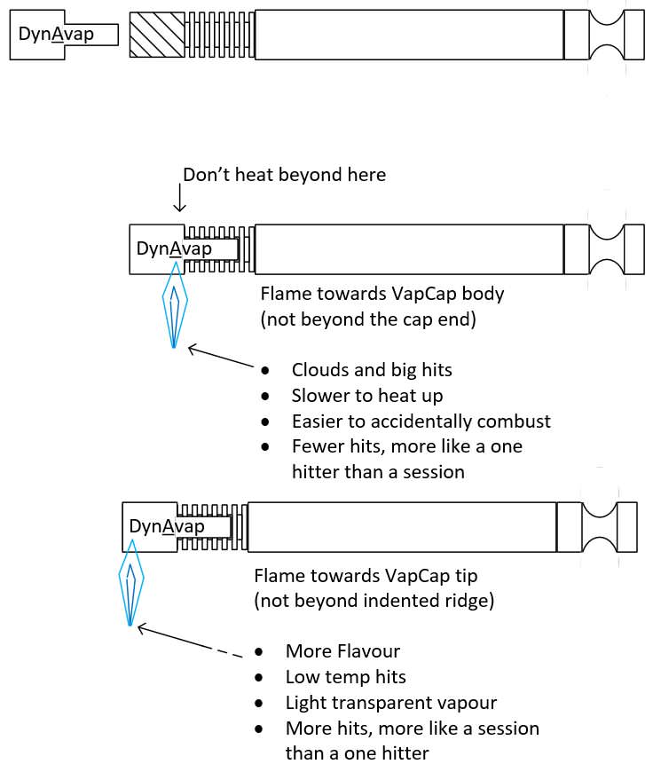
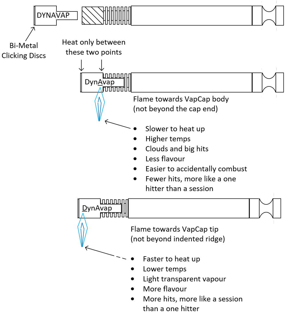
@grokit 's post below. Except that I'd put 3 nicely spaced exclamation points after "Heat only between these 2 points" 1 or 3 @ your discretion. Either a red or coral/orange-red font color. Not only do colors visually signify 'danger,' but it will add visual interest with another color in the mix. *Obviously, just in my mind, not necessary on paper.

It's your diagram, so it should be the way it appeals most to your eyes & sensibility.
I think an exclamation point is warranted, right after the "these two points" part

***Edited to say that I see you are going to incorporate the exclamation points.
#2) For the sake of uniformity, I would invert Big hits & more clouds. Only because ya gotta take the hit to have the cloud.

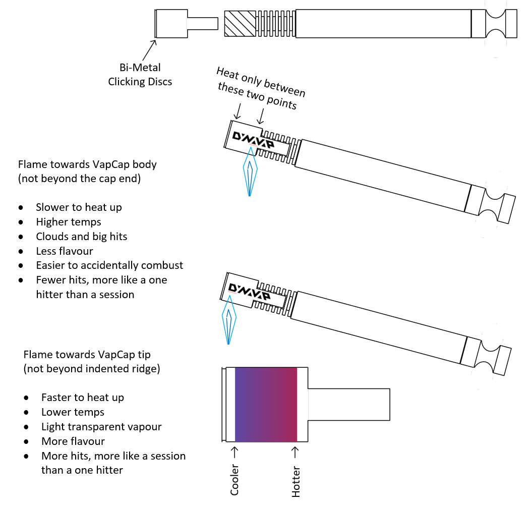
#3) I would put Cooler & Hotter on the top w/ down arrows & insert
Faster & Slower Heat in their place with the up arrow.

You might have to make the cap diagram smaller, maybe move it over down a little, over to the right &/or use a smaller font horizontally.
OR, you can put the this illustration
between the 2 tilted vcs & this way they are more in-line with their description on the left. I now you'll make it look good.

#4) Be sure to title the diagram, whether @ the top of the diagram page or in your post text above & outside the diagram. Then I'd let the diagram stand on it's own because it's perfect. Obviously, you'll label it The (Dyna)Vapcap Cap, but I would be sure to say
"steel cap" since as I heard that 1x on the board that supposedly George is coming out with a Ti one. So it's gotta be descriptive enough to stand the test of time as the steel cap is gonna be around for a long time. You can always date it, and take signature credit, along the the bottom. And, then, if & when, the Ti cap materializes you can do that diagram, too.

Your legacy will live on for years to come on FC!

#5) In the same post, under your diagram, I think you should put the dynavap links I had at the bottom of my posts, but just the 4 specifically for the cap. Your diagram & George's vids complement each other extremely well.
As I said, you can post it or I'll post it. Just checked the Best of Nominations & Squiby nominated 6 of her original posts in 2 BoN posts, so you should feel comfortable nominating your own.
Greenhopper, as you can see (& everyone else, too), I really get into stuff like this, either working independently or as a collaboration, as I was (& who knows, maybe will be again) a secretary. I'd love to have been a graphic software artist. So Greenhopper, consider me your right-hand Gal Friday.

And, lastly, at the bottom of my last post, I called you Grasshopper

I'm sorry, forgive me, Boss.

But honestly, Greenhopper, you did a fabulous job! Kudos! This referral link should reduce the ad nauseam questions concerning the cap significantly. And between your diagram & the vids. the newbies are going to be able to to get a handle on how the vc works because they'll be able to see it visually in your diagram & George's vids. This is a great start at reducing the confusion which makes us newbies feels like this


I look forward to seeing your finished product.
Thank you for allowing me to participate.

If you post the finished diagram tom. I won't see it if it's in the later afternnon as this girl's going to a Chicago/Doobie Bros. concert at Jones Beach!

So I'll look for it when I get home around midnight.


 OK, a couple of things will make this fabulous!
 It's your diagram, so it should be the way it appeals most to your eyes & sensibility.
 You might have to make the cap diagram smaller, maybe move it over down a little, over to the right &/or use a smaller font horizontally. OR, you can put the this illustration between the 2 tilted vcs & this way they are more in-line with their description on the left. I now you'll make it look good.
  Your legacy will live on for years to come on FC!
 I'm sorry, forgive me, Boss.


