
-
SCAM WARNING! See how this scam works in Classifieds.
You are using an out of date browser. It may not display this or other websites correctly.
You should upgrade or use an alternative browser.
You should upgrade or use an alternative browser.
VapeXhale.com Slider Image Contest
- Thread starter vtac
- Start date


grokit
well-worn member
Looks good to me Richy!
I just deleted all of my non-final images from the hosting site, to both eliminate any confusion and help these pages load a little faster.
Page two of this thread is a bear to load, particularily on a mobile device so I would encourage others to do the same if possible.
edit:
Whoops, he did it again! Can anybody spot the change?
It's the same on all three versions:


This is fun, I just can't stop fucking with these!

I just deleted all of my non-final images from the hosting site, to both eliminate any confusion and help these pages load a little faster.
Page two of this thread is a bear to load, particularily on a mobile device so I would encourage others to do the same if possible.
edit:
Whoops, he did it again! Can anybody spot the change?
It's the same on all three versions:
This is fun, I just can't stop fucking with these!
Last edited:
Richy
Frequently up in space with Bowie
Thanks Grokit.
I think we can all agree that although it would be sweet to win the hydratube that the true prize is actually having one of our creations representing such a great product.
I'm just waiting for the flood of entries as we approach the midnight deadline as I'm sure they're all gonna be awesome. Unfortunately I've got to go out so I might not be here to experience it live.
Good Luck to everyone that enters and has already done so.

Enchantre
Oil Painter
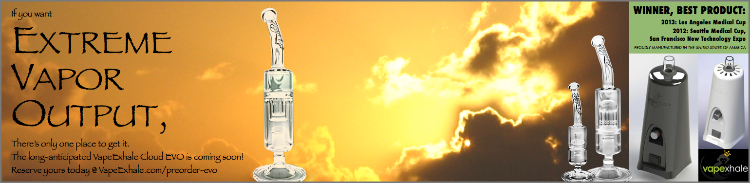
That one, I think, would be perfect if it said "Cloud" before EVO....Hey VXC,
I tried to keep it simple & clean, but popping!
Cheers to all the contestants
")
I like the flow of it.
Hazzod
Well-Known Member
You might be right,That one, I think, would be perfect if it said "Cloud" before EVO....
I like the flow of it.
although vtac's post said "we would like the slider to say: Coming soon, the VapeXhale EVO"
Hmm... the question is:
If Vapexhale is the company, then is the product named Cloud EVO, or EVO?
Since it's more of an upgrade of the Cloud, I agree that Vapexhale Cloud EVO makes sense.
Live-N-Learn
Higher, Higher, Baby...
I had everything laid out in photoshop and i was bored so i messed around with the timeline feature to try and make a gif. Well heres what I got.  is it slow or fast to u? everywhere i view it, the speed is different lol.
(i think when u click to expand it starts the gif)

is it slow or fast to u? everywhere i view it, the speed is different lol.(i think when u click to expand it starts the gif)
Correct it is VapeXhale Cloud EVOThat one, I think, would be perfect if it said "Cloud" before EVO....
I like the flow of it.

 Good job everyone who entered! Some real great entries out there.
Live-N-Learn
Higher, Higher, Baby...
You might be right,
although vtac's post said "we would like the slider to say: Coming soon, the VapeXhale EVO"
Hmm... the question is:
If Vapexhale is the company, then is the product named Cloud EVO, or EVO?
Since it's more of an upgrade of the Cloud, I agree that Vapexhale Cloud EVO makes sense.
I like Cloud Evo, but when I was making it, I also liked working with just EVO as well. Makes it seem a bit more intense imo.
Nonetheless I followed the instructions as given, and only included EVO.

11eleven11
Well-Known Member
Here are my favorites. Not descending by favorites... just the order of when they were posted.


Design/Code/Deliver
New Member
Definitely the one I would choose, clean and ready to load onto your site without ruining the vapexhale asthetic currently there. Nice job gvape
These are really, really cool! We will be discussing which ones we like best today.
SnidelyWhiplash
Well-Known Member
Really great stuff guys. I'm too f-ing booked to try more revisions today. I am more of a programmer than I am a graphic designer though I've been schooled by some amazing cats.
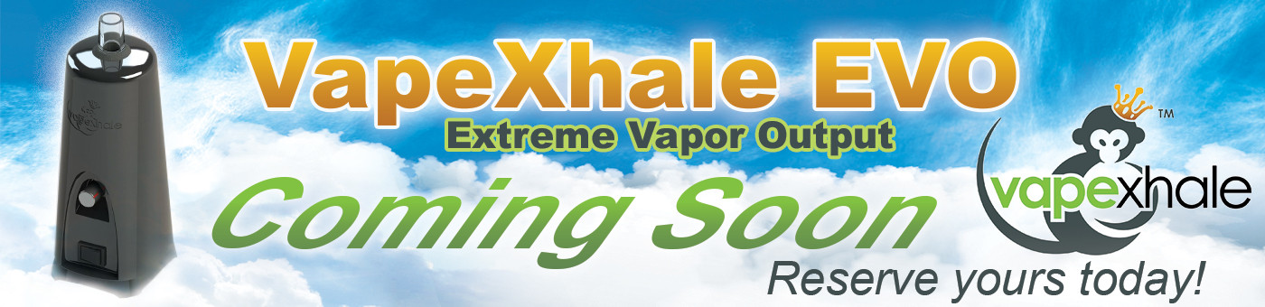
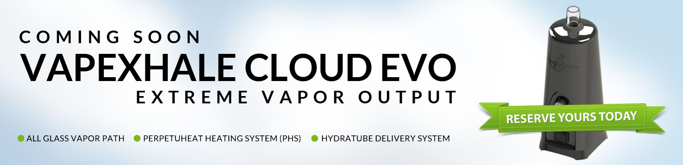
What you all should be paying attention to (so I have learned from being scolded by print-masters) are these detais:
Font: there should pretty much NEVER be more than 3 fonts on an ad. Usually just Logo font and text. Adding more would only add mental confusion. This one kicks ASS in that front.
Horizontal Planes: Creating balance and flow so there is enough space to take in the primary message without distraction.
This one kicks ass on all those fronts. But not particularly making me want to whip out 5-600 bucks on a impulse, which is the purpose of a presale add:
This one is balanced and a little more mysterious which is good:
Whereas on the other spectrum, this one is pure inspiration, it makes me ready to drop money:
Too many fonts, I would ace the top left wording for sure. Love that it's 8bit on the smoke, its some underground funky shit.
If I finish my contracts today, Ill try again, but you guys kick ass.
SnidelyWhiplash
Well-Known Member
^Good catch, you are right, I've unified them and it looks certainly a bit better. You've probably been schooled better than me (I've basically schooled myself at art, profesionaly I am a programmer).
You are mad creative, don't classify yourself.
I used to make websites/creative for the high-end fashion industry. They would scream at me if I broke the cardinal branding rules. Bunch o Freaks. Hahahaha
For that matter, these would all flow better with the top of the website if they incorporated actual Branding fonts and matched the site font.
grokit
well-worn member
these would all flow better with the top of the website if they incorporated actual Branding fonts and matched the site font.
The lowercase "a" is a dead giveaway for when the font does not match VXC's, it can be easily changed but for an example check out the second one that you featured in your earlier post.
I love the design though, there's so many good ones!
Last edited:
SnidelyWhiplash
Well-Known Member
O.K one quick last stab, I honestly think you guys got it licked already:

And here is one with more icons:

And here is one with more icons:
Last edited:
We had a tough time deciding so we are going to have multiple winners... Once we figure it out, I'll post an announcement shortly!
ogcook
Well-Known Member
I may have a chance after all!We had a tough time deciding so we are going to have multiple winners... Once we figure it out, I'll post an announcement shortly!

11eleven11
Well-Known Member
YOU GET A HYDRATUBE! YOU GET A HYDRATUBE! EVERYONE GETS A HYDRATUBE!

Live-N-Learn
Higher, Higher, Baby...
YOU GET A HYDRATUBE! YOU GET A HYDRATUBE! EVERYONE GETS A HYDRATUBE!
