Hey @Dan Morrison this thing is looking smoooooth! If you run into any snags with your heater design my offer to toss some wattage in that beauty still stands. It might reduce your technical effort allowing you to focus on the killer design elements. Keep killin' it.
-
SCAM WARNING! See how this scam works in Classifieds.
You are using an out of date browser. It may not display this or other websites correctly.
You should upgrade or use an alternative browser.
You should upgrade or use an alternative browser.
The Nomad From Morwood
- Thread starter Dan Morrison
- Start date
@RastaBuddhaTao , Thanks for the kind words my friend! And the generous offer as well. This community never ceases to put a smile on my face! As it stands I am still chasing my heater day dreams though... we'll see how she goes. haha.
I've been obsessing over the design of the internals.. but things are coming along nicely!
The aesthetic design has remained the same as my last concept art.... with the exception of the LED, Which I had to move to a different location.
I will briefly paint a picture of what I've got going on in the prototype:
All components easily accessible and user serviceable.
All electrical connection points will be accessible for cleaning.
Non-soldered connections kept to a bare minimum to reduce overall circuit resistance.
Aesthetic principles will be carried through into the internals. Remember how cool it was to see the inside of darth vaders mask? Thats the feeling I want when I open this badboy up.
The entire bottom half will be like a convertable top...removable..for complete access to the internals, allowing for replacement of the heater on-the-go without tools. This also allows the heater to be accesible from both sides, giving you the option to fit a heater dish, plate, mesh or whatever.. You could then adapt the mouthpiece to the downstem of a water tool..so the entire vape is upside down. Now you may use concentrates in the traditional e-nail way on the fully exposed heater.
I think that the swappable heater is the bread n butter here... with removable base.. you are unlimited in the depth of your heater core, you could adapt a 6 inch long heater if you really wanted...not that a single 18650 would power such a beast...
I'm also toying with the idea of an adjustable air inlet for complete control over draw resistance. At the very least you will be able to manually cover the inlet with a finger.
Mechanical hard OFF switch for safety.
Bonus design goals... The LED will come on when the safety switch is released and the vape is ready... but it'd be really neat if it only came on the moment that the bottom half of the vape is fully connected. It'd sorta feel like loading a clip into the bottom of a laser gun or something... the motion of connecting the two halves causes the whole to power up...there's something magical in that I think!
Welp, that's all for now! Loving all the comments/support in here!

Last edited:
Sure thing!
natural farmer
Well-Known Member
Fat Freddy
FUCK CANCER TOO !
Absolutely beautiful concept design!
http://i.imgur.com/ihbzGbp.jpg
How does one get on the mailing list?
http://i.imgur.com/ihbzGbp.jpg
How does one get on the mailing list?
D
Deleted member 22423
Guest
Absolutely beautiful concept design!
http://i.imgur.com/ihbzGbp.jpg
How does one get on the mailing list?
Those are beautiful. Kudos for the unique design.
How does one get on the mailing list?
Thanks! And just send me a PM with your email.

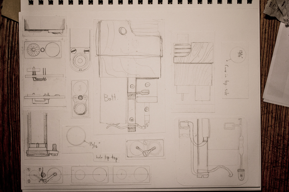
Here's some more progress work sketches, for those who were curious about my process.
These are just some older sketches, mostly measurements and the design of the internals. All failed designs, but neat looking non-the-less.

This is the current design, a simplified drawing to show just the "heater module" component. It's a side view of the body, after the steel "shell" is removed. The heater module is the square with the prongs.
The prongs are the + and - posts that carry electricity from the battery to the heater coil. Gold plated plugs that plug right into the bottom of the vape body. These plugs are rated to carry 95Amps and the gold plating solves the corrosion issues of brass/copper connectors. In case you were wondering there are two prongs on that module..but since it's the side view.. the background prong is hidden behind the foreground prong... if that makes sense.
The gray tube holds the heater coil inside, and when inserted into the vape, makes an air tight seal between the heater module and the vapor path. Like a little Lego block.
The heater modules are shrouded in a wood cube so that they can be removed when hot. Imagine this, instead of adjusting a variable temperature knob, you instead plug in a new heater module with a heater of a different resistance value, different heat up time and max temperature. If you wanna get real crazy.. You could plug in a halogen bulb module, or a liquid reservoir... or an e-nail.
On the aesthetics side of things... different modules could be made from different woods, and stamped with a little symbol, or colour code marks...

These are just some older sketches, mostly measurements and the design of the internals. All failed designs, but neat looking non-the-less.

This is the current design, a simplified drawing to show just the "heater module" component. It's a side view of the body, after the steel "shell" is removed. The heater module is the square with the prongs.
The prongs are the + and - posts that carry electricity from the battery to the heater coil. Gold plated plugs that plug right into the bottom of the vape body. These plugs are rated to carry 95Amps and the gold plating solves the corrosion issues of brass/copper connectors. In case you were wondering there are two prongs on that module..but since it's the side view.. the background prong is hidden behind the foreground prong... if that makes sense.
The gray tube holds the heater coil inside, and when inserted into the vape, makes an air tight seal between the heater module and the vapor path. Like a little Lego block.
The heater modules are shrouded in a wood cube so that they can be removed when hot. Imagine this, instead of adjusting a variable temperature knob, you instead plug in a new heater module with a heater of a different resistance value, different heat up time and max temperature. If you wanna get real crazy.. You could plug in a halogen bulb module, or a liquid reservoir... or an e-nail.
On the aesthetics side of things... different modules could be made from different woods, and stamped with a little symbol, or colour code marks...

Andreaerdna
If God is the answer, then the question is wrong
@Dan Morrison It would be a better world if you were in charge of a little more than creating vaporizers (TBH I am very, very glad you are)
I would love to drive a car (transport device) or to live in a house designed by you
I would love to drive a car (transport device) or to live in a house designed by you

Fat Freddy
FUCK CANCER TOO !
@Dan Morrison It would be a better world if you were in charge of a little more than creating vaporizers (TBH I am very, very glad you are)
I would love to drive a car (transport device) or to live in a house designed by you
Our very own Frank Lloyd Wright of inhalation devices!


.
Just had an interesting thought.. The butane module. Instead of a coil, you have a bent glass tube for butane power. No modifications to the design needed, just plug and play. Flip upside down and adapt to downstem, now you have a butane vape bong in one.
Ready to go for a hike? Unplug the butane module... plug in your coil, pack a new battery and away ya go.
This is really shaping up now!
Ready to go for a hike? Unplug the butane module... plug in your coil, pack a new battery and away ya go.
This is really shaping up now!
°k
The sound of vapor
Been waiting for a modular vape for a while now, on you go Dan, let's make this happen!Just had an interesting thought.. The butane module. Instead of a coil, you have a bent glass tube for butane power. No modifications to the design needed, just plug and play. Flip upside down and adapt to downstem, now you have a butane vape bong in one.
Ready to go for a hike? Unplug the butane module... plug in your coil, pack a new battery and away ya go.
This is really shaping up now!
Edit: while you're at it let's make an option for a halogen heating module too!
Last edited:
StormyPinkness
Rhymenocerous ʕ•ᴥ•ʔ
I'm definitely a fan of having both. Sometimes I don't want to be tied to batteries and long charging times and other times I don't want to be tied to noisy butane lighters that run out and/or randomly break.Just had an interesting thought.. The butane module. Instead of a coil, you have a bent glass tube for butane power. No modifications to the design needed, just plug and play. Flip upside down and adapt to downstem, now you have a butane vape bong in one.
Ready to go for a hike? Unplug the butane module... plug in your coil, pack a new battery and away ya go.
This is really shaping up now!
vapen00b
Many vapes & accessories. Always happy to help
Just had an interesting thought.. The butane module. Instead of a coil, you have a bent glass tube for butane power. No modifications to the design needed, just plug and play. Flip upside down and adapt to downstem, now you have a butane vape bong in one.
Ready to go for a hike? Unplug the butane module... plug in your coil, pack a new battery and away ya go.
This is really shaping up now!
Been waiting for a modular vape for a while now, on you go Dan, let's make this happen!
Edit: while you're at it let's make an option for a halogen heating module too!

Great stuff!


@Dan Morrison Trying to contact you via PM.

Just had an interesting thought.. The butane module. Instead of a coil, you have a bent glass tube for butane power. No modifications to the design needed, just plug and play. Flip upside down and adapt to downstem, now you have a butane vape bong in one.
Ready to go for a hike? Unplug the butane module... plug in your coil, pack a new battery and away ya go.
This is really shaping up now!
Can we have a module that runs on my sparkling wit, effervescent personality and red hot looks?
stickstones
Vapor concierge
Just had an interesting thought.. The butane module. Instead of a coil, you have a bent glass tube for butane power. No modifications to the design needed, just plug and play. Flip upside down and adapt to downstem, now you have a butane vape bong in one.
Ready to go for a hike? Unplug the butane module... plug in your coil, pack a new battery and away ya go.
This is really shaping up now!
That's fucking brilliant!
When does the solar powered heater come out?
subway13029
Well-Known Member
I'm on board for this beast..loving how this is shaping up..
Alright, some updates!
After making some physical prototypes in the design of my last concept art, with the steel sleeve, etc.. I've decided to make some changes.
First, the steel sleeve was too cold, and heavy. It really didn't feel very good in the hand.
The sleek flush exterior design also didn't appeal to me. It looked clean with a touch of modern in the drawing, but in real life it was a bit boring, too modern, too clean. That solid "block" shape made the entire device feel chunky. What works as a 2D side profile, may not work as a 3D object...
...so I went back to the drawing board to re-consider the core aesthetic theme, and figure out exactly what design elements I was missing.
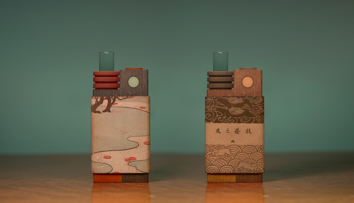
After some thought, this is what I came up with.. Two examples.. on the left, a bit more wild, with red padauk wood and walnut, and on the right a more matching colour scheme.

It mixes in an element of recycling. Which I think is central to the cyber punk theme.. building upon the past, a mash-up of old an new.. neon signs over art-deco buildings (Blade Runner).
I am going back to Kraft paper laminate for the sleeves, they have the perfect amount of springyness to allow for a smooth sliding fit without wear. They are warm to the touch, with a unique texture. And they can be customized and replaced with ease. Painted with black milk paint and sanded smooth, they pretty much look identical to black patina'd steel, but with a better feel and much lighter weight.
One idea I have is to get antique Japanese block printed books for making custom sleeves by pasting the old text/images/paper over top of the kraft paper. (shown above)
As far as durability is concerned, well you can think of the kraft paper laminate as a softer version of Micarta, and Micarta is damn tough. I could use resin with paper/cloth for an even stronger sleeve if it proves necessary.
The step down between the sleeve and wooden body give the entire design a much better look, IMO. Not sure why... but it just does.
The underlying wooden body will be all one piece, so you can slide the sleeve up or down.
The "module" feature is still very much alive. The red and orange blocks of wood at the very bottom of the vapes shown above are the modules, which have been plugged into the main body, and partially covered with the sleeve. Different exotic woods can be used for the modules to give different looks. To remove the module, just slide the sleeve up and pull the module out. The gold plated terminal plugs hold the modules in there very solidly.
The glass stem "collar" (heat sink lookin' thing) will be made from wood. A metal one would make the vape too top heavy.
Glass stems may also be switched out for more fancy wood mouthpieces, with more organic flowing lines... sort of like a nice tobacco pipe mouthpiece.
I made the frosted LED light bigger, seems to work better once you see it in person. Remember that this entire vape fits in the palm of your hand... so as you scale it down from what's on the computer screen, things can look different.
Sharper edges all around. The rounder the corners, the worse things got, haha. I played with all sorts of radii. The contrast between the slightly rounded edges of the kraft paper sleeve, and the sharper edges of the underlying wood body is really nice.
After making some physical prototypes in the design of my last concept art, with the steel sleeve, etc.. I've decided to make some changes.
First, the steel sleeve was too cold, and heavy. It really didn't feel very good in the hand.
The sleek flush exterior design also didn't appeal to me. It looked clean with a touch of modern in the drawing, but in real life it was a bit boring, too modern, too clean. That solid "block" shape made the entire device feel chunky. What works as a 2D side profile, may not work as a 3D object...
...so I went back to the drawing board to re-consider the core aesthetic theme, and figure out exactly what design elements I was missing.
After some thought, this is what I came up with.. Two examples.. on the left, a bit more wild, with red padauk wood and walnut, and on the right a more matching colour scheme.

It mixes in an element of recycling. Which I think is central to the cyber punk theme.. building upon the past, a mash-up of old an new.. neon signs over art-deco buildings (Blade Runner).
I am going back to Kraft paper laminate for the sleeves, they have the perfect amount of springyness to allow for a smooth sliding fit without wear. They are warm to the touch, with a unique texture. And they can be customized and replaced with ease. Painted with black milk paint and sanded smooth, they pretty much look identical to black patina'd steel, but with a better feel and much lighter weight.
One idea I have is to get antique Japanese block printed books for making custom sleeves by pasting the old text/images/paper over top of the kraft paper. (shown above)
As far as durability is concerned, well you can think of the kraft paper laminate as a softer version of Micarta, and Micarta is damn tough. I could use resin with paper/cloth for an even stronger sleeve if it proves necessary.
The step down between the sleeve and wooden body give the entire design a much better look, IMO. Not sure why... but it just does.
The underlying wooden body will be all one piece, so you can slide the sleeve up or down.
The "module" feature is still very much alive. The red and orange blocks of wood at the very bottom of the vapes shown above are the modules, which have been plugged into the main body, and partially covered with the sleeve. Different exotic woods can be used for the modules to give different looks. To remove the module, just slide the sleeve up and pull the module out. The gold plated terminal plugs hold the modules in there very solidly.
The glass stem "collar" (heat sink lookin' thing) will be made from wood. A metal one would make the vape too top heavy.
Glass stems may also be switched out for more fancy wood mouthpieces, with more organic flowing lines... sort of like a nice tobacco pipe mouthpiece.
I made the frosted LED light bigger, seems to work better once you see it in person. Remember that this entire vape fits in the palm of your hand... so as you scale it down from what's on the computer screen, things can look different.
Sharper edges all around. The rounder the corners, the worse things got, haha. I played with all sorts of radii. The contrast between the slightly rounded edges of the kraft paper sleeve, and the sharper edges of the underlying wood body is really nice.
D
Deleted member 22423
Guest
Beautiful!
Fat Freddy
FUCK CANCER TOO !
WOW! @Dan Morrison
Is there a vape exhibit at MOMA, or perhaps the Guggenheim? I'm thinking these would be a great entry to kick start such an exhibit!
Truly admire your artistic persistence and vision! The modularity of design will allow your art and the consumer's to blend and evolve together quickly, no doubt.
So what's under the hood, Daniel? Convection? Hybrid? Replaceable or swappable batt? Watt output?
FF
Is there a vape exhibit at MOMA, or perhaps the Guggenheim? I'm thinking these would be a great entry to kick start such an exhibit!

Truly admire your artistic persistence and vision! The modularity of design will allow your art and the consumer's to blend and evolve together quickly, no doubt.

So what's under the hood, Daniel? Convection? Hybrid? Replaceable or swappable batt? Watt output?

FF
Damn! those are works of art!^ freddy beat me to it. I would proudly display your art, the fact that it also serves as an instrument of augmentation is far and above what I expected with this endeavor.
Thanks for sharing, Dan. Whatever your muse, keep it flowing man!
Cannot wait to invest in your vision.
Thanks for sharing, Dan. Whatever your muse, keep it flowing man!
Cannot wait to invest in your vision.
Thanks guys!
@Fat Freddy , Under the hood. My main module will be convection, SS316, 50W +- 15w depending on batt. voltage. Single 18650, swappable.
The second module to develop will be butane powered, glass elbow style, akin to the brick style butane vapes.
I figure it would be neat to switch between the two styles.
Next I think it would be great to have a dish style, or e-nail sort of module. And a lower wattage SS coil.
And of course, I would have to make a charcoal holding module, for the ol' Okin experience.
danald2000
Well-Known Member
any ideas on price of vape and modules? damn this is a sexy vape dan!

