A quick take on the RBT logo - my opinion, I like the current logo, just find it a little too clean and too complicated, a proper logo should work in any color or no color, and from postage stamp size to side of a building.
No great slogans yet, I really like the word "modularity", which I see used elsewhere in vaporizer discussions but doesn't seem owned yet.
Modnote: Edited to display image
Thanks for the continued input. I am in agreement in large part. I let Steve know that I think since the in your face logo will be branded on the unit that something in the spirit of an old western branding theme would be cool... but it's brandability seems to be pretty important. So, in a way, it has to be black and white, at least on the unit. My only other thought is to maintain the triangle element in some way and that the Rasta colors don't seem to speak to the brand. He is an extremely talented guy and he has big plans for the brand so I know that he will create something iconic with our input.
Oh damn Doc going even more custom?! Nice! Can't wait to see
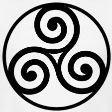
Along with black and white, I also dig the swirls, triangles are great for the rule of three, but the swirls give off the right vapor vibes to me. I've also always been a fan of the triskele, which this logo reminded me of, first the two top right ones below, but really any of these:


Part of what I like about the current logo is how it is unique, I guess we'll see where it goes... And slogan wise, so maybe something playing on the three? Instant Power and Flavor?
So Speed Power Purity are the three?
Vape Your Senses with Speed Power Purity?
Or to be more precise, Vape Your Senses with instant power and pure flavor?
Ok, so I wanted to take the time to respond to these and get some opinions.
I think a lot of you have touched on this, but just to share my branding experience: A brand's logo should first and foremost be simple. If it cannot be recalled from memory easily there's a problem.
The current logo can be a nice starting point and we do want to maintain the "3 theme". It's deeply embedded in the company values so the notion of 3 needs to be present and obvious.
@hippogriff , thank you for the multiple mock-ups. They are very helpful. I liked the idea with the multiple shades of green. It's simple and the colors are consistent with the product. The middle left is my favorite.
@RastaBuddhaTao , I'd like to have the online logo either be black and white or use simple colors. If we used a colored logo we can easily strip the colors for the sake of physically branding on the logo to products. Let's discuss later if you need clarification.
@Shit Snacks , I like what you were thinking with the swirls, but I'm afraid of over-complicating anything. But again, thank you for your continued input.


